Tangram Pasta Packaging
Overview: Research, branding & packaging design
Role: Brand Designer
Tools: Adobe Illustrator, Adobe Photoshop
The origin of Tangram puzzles began in Imperial China during the Tang Dynasty and have been continued to used till present day. Tangram puzzles have been a staple to childhood for years Wand can be both entertaining and educational. The brand, Tangnam Pasta, was created to engage those of all age by utilizing shapes that are familiar to all of us.
Mood Board & Inspiration
The brand’s concept stemmed from wanting to create a product that was appealing to all ages, therefore being recognizable and something we have most likely all came into contact with. Tangram puzzles have been a staple to childhood for years and can be both entertaining and educational. For this logo design, I wanted to utilize the shapes that are nostalgic of tangram blocks.
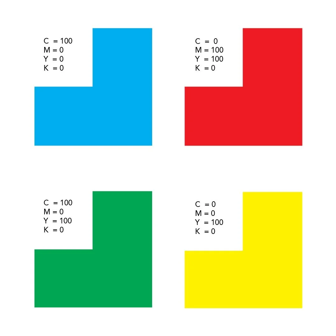
Color Palette
I wanted to use primary colors and green in this logo to exude youthfulness and to mimic that of the original tangram puzzle pieces.
Iteration
The logo creation was based around tangram puzzle pieces and all the shapes you can make with them. The heart gives a sense of family, yet also the love and playfulness of children. There is nice repetition within the letters of the brand’s name giving it balance and a natural center. The crossbar of the ‘A’ was removed in some iterations to really emphasize the geometry of the shapes.
In the end, Tangnam Pasta was developed into a organic geometric pasta brand that brings consumers back to their youth, while also encourage children to be curious about shapes and geometry.


